The Digital Humanities community and Agile software development process both encourage reflection and retrospection, taking time to learn from successes and failures.
Derrida’s Margins is the first project that the CDH Development & Design Team completed and made publicly available, which means there were a lot of “firsts” we hit with this project. That also means we made some mistakes, and learned a lot in the process. Here are some of the lessons learned that I’m working to carry forward on other projects so that we can do better next time.
Many of these lessons may seem pretty obvious in hindsight, and maybe that’s always the case — but the problems were not obvious when we were in the thick of things trying to get the work done.
Disconnects between developers and designers#
Discrepancies between understanding of features and what is in scope#
There’s always more than one way to describe a set of features. This is something that’s become much more clear to me over the past two years at CDH: I tend to work from text description of features, both high-level lists of features and more granular user stories that can be implemented and tested. However, not everyone is so text-oriented! (Alan Jacobs once suggested to me that programmers and poets share an uncommon text orientation, something I’d love to think about and investigate more at some point.) Visual depictions of features are very compelling, and sometimes much more comprehensible to our collaborators.
The discrepancies between describing and documenting which features are in scope were particularly difficult on this project because our last UX Designer used a process that was much more waterfall in nature, even as I was working to progressively shift my team to a more agile, iterative model for developing the software. Individual phases of her process were iterative, but she designed everything at once, including features that we did not plan to build for the first public release (which we describe internally as Minimum Viable Product, or MVP, although we also have had some conversations about how well that works for scholarly software). This is confusing for stakeholders, because they see features designed that we don’t plan to implement, and it’s confusing for developers because it’s much easier to work from the designer’s specifications than to refer to a list of features or user stories about what exactly should be built now.
Going forward, we’re shifting to a more Agile approach to design, which should help to address this. We will either not include non-MVP features in design mockups, or will provide a visual indicator to make it clear which design elements will be added later.
Designers and Developers have different concerns#
Designers create specific layouts, with the goal of creating a clear, usable interface that provides consistent user experience and visual identity.
Developers want to write reusable code and templates. They want a logical layout that can be generated semantically rather than something that needs to be hard-coded.
The CDH Development and Design Team does work as a team: we are in frequent conversation about how difficult or easy things are to implement, and talk about how we want to approach features before we build them. Usually we discuss design features before options are even offered to the project team, to ensure that the designer isn’t suggesting things that the developers can’t or don’t want to build. But even with that, we can’t catch everything. On this project, we had the additional complication of working with a remote contract frontend developer, since we had not yet filled that position on the team, which made collaboration more difficult.
This project includes a set of complicated filters for three different kinds of content — library books, references, and interventions (or annotations). The filters are similar, and the same set of widgets are used across all three pages, but in different layouts and with some important variation.
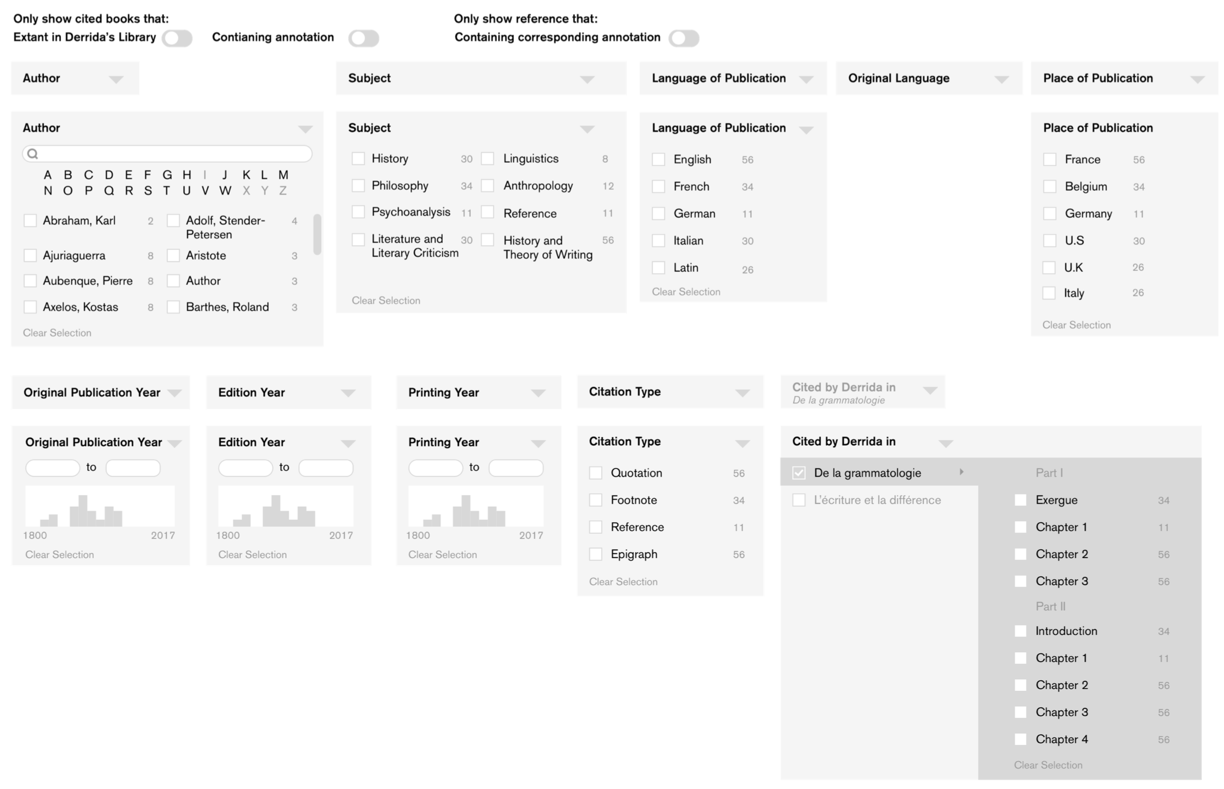
In the case of the references and interventions, we’re actually filtering on attributes specific to the reference or intervention and also attributes on the related book. There was some attempt (possibly too late in the process) to clarify that in the design for some of the toggles on the reference list, but if you look carefully at what’s currently implemented on the site you’ll see we didn’t get to that. In the code, we’re generating the filters from Django forms, but the templates that display and generate the filters redefine the order and are more complicated than I’d like. This is why it was difficult to implement the filters as designed.
We don’t have a clear solution to this yet, but hopefully better conversation between designers and developers can help us come up with more elegant solutions that both designer and developer will be happy with. In particular, making an effort to ensure the UX design is more closely aligned with the underlying data model should make these kind of disconnects less likely.
Cross-platform tools may be limiting#
For this project, we chose Haystack for search and browse with Apache Solr. Haystack is popular, well-maintained, documented, and has an active developer community. However, we found it hard to customize, slower and less efficient than we would have liked, and difficult to integrate into unit testing. Haystack is built to work with multiple search backends, so it makes some sense that it might not take full advantage of those tools.
In our case, we discovered that Haystack doesn’t support Solr numeric range faceting, which we needed for the multiple date range filters designed for the site. I had to extend the default Solr backend to add the range facet support we needed. In an ideal world, this is something that we would contribute back to the Haystack community, but of course that takes time, and the fact that there’s an open pull request from 2014 to add range faceting that was never completed makes it harder to want to make that effort.
It worked in our favor that the next project where we implemented Solr search was the Princeton Prosody Archive (PPA). I had already determined Haystack wasn’t a good fit for PPA, because the full text content isn’t stored in the database and Haystack only indexes database content. Working on PPA gave us a chance to figure out a new way of working with Solr and Django: we’re using SolrClient, which gives a thin layer over the Solr APIs without restricting access to features. We applied things we’d learned from working with Haystack, such as signal handling to trigger indexing updates when records are edited in the database. We’ve since adapted this approach for preliminary work on The Winthrop Family on the Page, and plan to generalize it into a reusable Python library soon when we apply it to a third project.
We’ve been pleasantly surprised to discover how much faster our implementation is than using Haystack. It’s possible we could optimize Haystack better for our uses, but my guess is this is another place where the cross-platform nature of the tool is limiting for our particular use. Obviously, there are trade-offs: there are a lot of things built into Haystack that are convenient, and a large community of developers working with it; but that can also make it harder to adapt and contribute.
Don’t leave accessibility until the end#
Web accessibility is important, and we learned on this project that it’s very difficult to correct after the interface and templates have already been built.

The complicated search filters in this project were not implemented with accessibility in mind; even the choice of Javascript libraries is important here, and if you don’t think about accessibility before choosing it’s a lot of work to refactor. In one place, we’re using selectize.js for custom styling on a select box, but it’s not an accessible solution. Unfortunately, our attempts to find an alternative indicate that there aren’t a lot of great options for accessible Javascript libraries in this area; when Ben Hicks researched it, he found that virtually every selectize analog had an open pull request for improving accessibility.
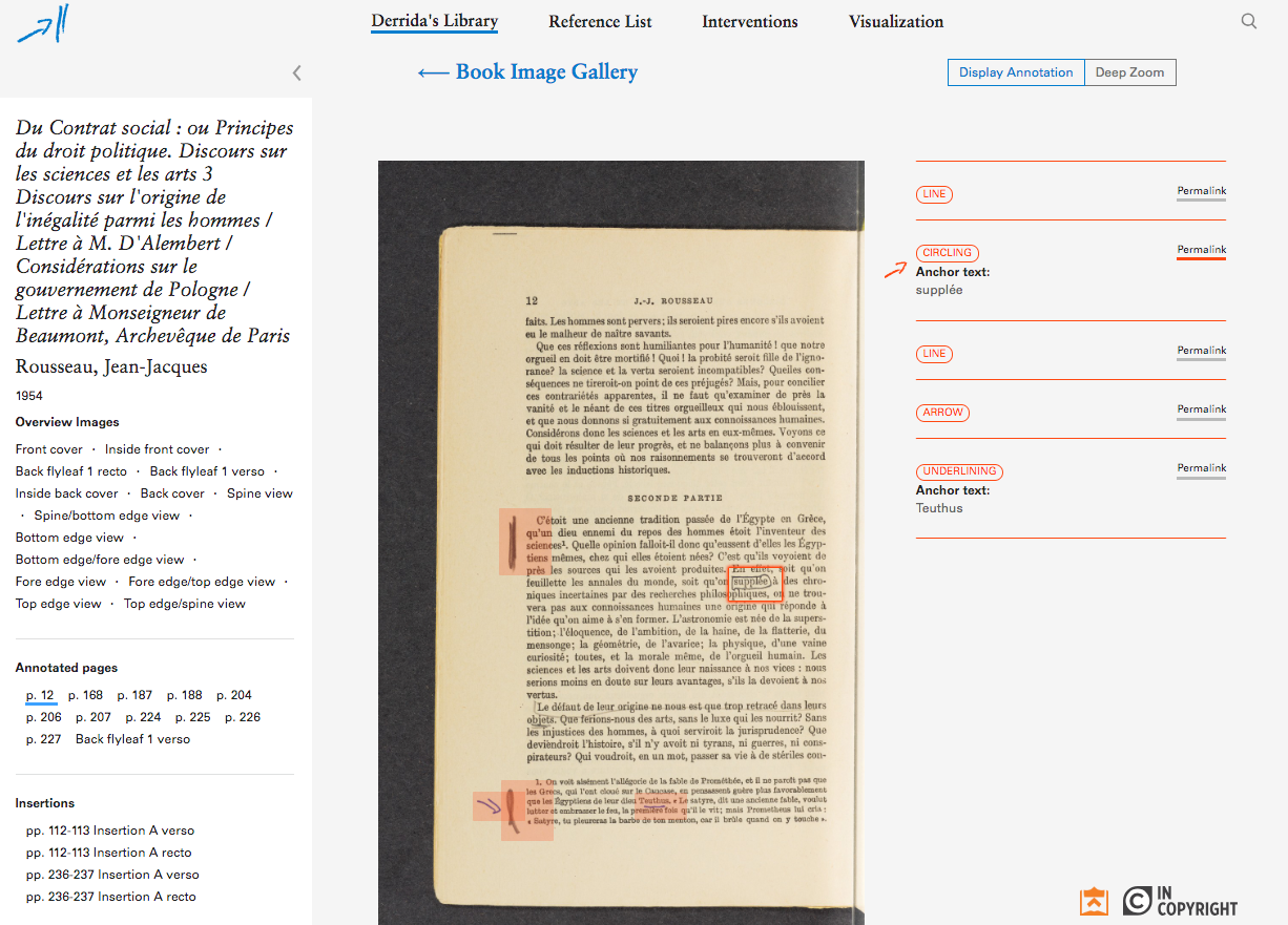
One particularly difficult aspect of the accessibility for this project is that displaying marginalia on pages is quite visual. How can we meaningfully convey that information to those with low vision? We made an effort here, by working with the Princeton University Library team to provide OCR text for the page images that are presented on the site, and making the links between highlighted blocks on the page image and descriptions of the annotations easier to navigate - but it’s hard to tell if that’s enough to be meaningful this is to a low vision person. I wonder if we could do better here, since the information we have for each annotated region ought to make it possible to describe where on the page a region falls. This is a candidate for experimentation, and we have some ideas for data physicalizations to make this data accessible in other ways.
We’re fortunate that Princeton has an accessibility review service through the Office of Communications, as well as training opportunities in accessibility through the User Experience Office.
Since learning this lesson the hard way, we’ve worked to integrate accessibility into our development process at the point when we start building the public-facing frontend interface.
- We’ve added pa11y-ci to our continuous integration builds, which we run on Travis-CI. This means we’re checking our templates and styles for accessibility as we develop, which makes it possible to catch problems as we’re working rather than finding them later.
- We’re taking advantage of training in accessibility. Nick Budak, our frontend developer has been studying for CPACC certification, which gives us in-house expertise.
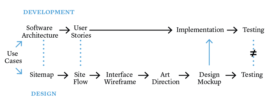
Iterative development#
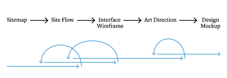
Develop features in small chunks and not big ones. Big chunks are never done!
To put that a different way, do this:

And not this:

I had already been trying to manage development work in a somewhat Agile, iterative fashion, but I still have a penchant for software releases that are defined by meaningful chunks of functionality rather than based on time-bound development. There were multiple complicating factors that made it particularly problematic in this case, but this was where I really learned the lesson that large releases that include lots of changes and functionality are very difficult to complete and deploy. Since then, I have worked hard to keep software releases smaller and more manageable, which I think has been reasonably successful.
Several weeks ago, at the request of my team, we shifted to an even more Agile, iteration-based and time-bound model. We’re now working in two-week iterations with the goal of releasing whatever functionality is tested and accepted at the end of that iteration. This means features are available sooner in production, but it also means a heavier load for those testing features. It’s working well so far, but we have yet to see how it will work with other project teams.
Conclusion#
Our efforts to learn from these difficulties and make improvements are still very much in progress. It’s both exciting and challenging that our work means there are always new problems to solve, new mistakes to make, and new lessons to learn from failure. As we do, we will continue to reflect on our process and share both successes and failures.
This post is adapted from a presentation given to a meeting of the Princeton University Research Programmers and Software Engineers on October 8th, 2018.